In this blog I’ll share a few plotting functions I regularly use.
Scatter Plot with Linear Fit
I originally wrote this function to plot scatter plots of two variables plus a linearly fitted line.
But later I realized seaborn already has regplot and lmplot that do the same thing but better.
You can read more about them in this tutorial (and learn not to re-invent the wheel!).
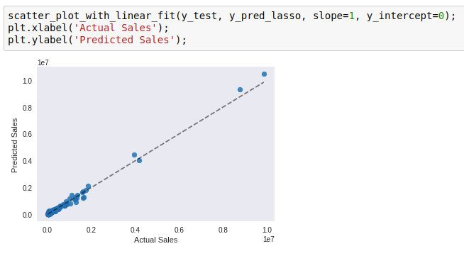
I have repurposed it to visualize model evaluation.
When your y is a continuous variable, you can plot the predicted y values on one axis, and the actual y values on another, and see how well they line up along y=x. To plot the y=x line, simply set slope=1, y_intercept=0.
Here is an example:
Correlation Heatmap
This is a wrapper function for seaborn’s heatmap. I use it to look at the correlations between variables in a pandas DataFrame, which is quite useful during exploratory data analysis.
Here is an example:
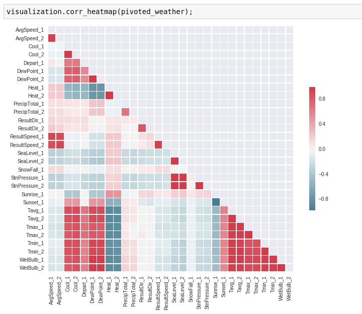
When you see highly correlated variables, you have to be very careful if you are using a linear regression model (the LINE assumptions!). Plotting a heatmap is a quick way to check for that.